last updated: may 20th 2026
Things I like and keep in mind when designing web environments. Feel free to use this as a guide (its kinda written like one) but keep in mind its a pretty preference heavy post too.
Contrast, colors and text.
Colors are fun, but comfort is key. I enjoy browsing indie websites, archives and collections of old sites. (not me spending hours on this oops) but things get ugly sometimes. While many are great, others unfortunately are an instant leave for me. A few things I appreciate and remember to back-check are:
- if colorful, check if colors actually fit together, create harmony
- less is more
- old web ≠ eyecancer
- avoid ultra-strong contrast, 40-80% offer best comfort
- avoid poor contrast 20% and under
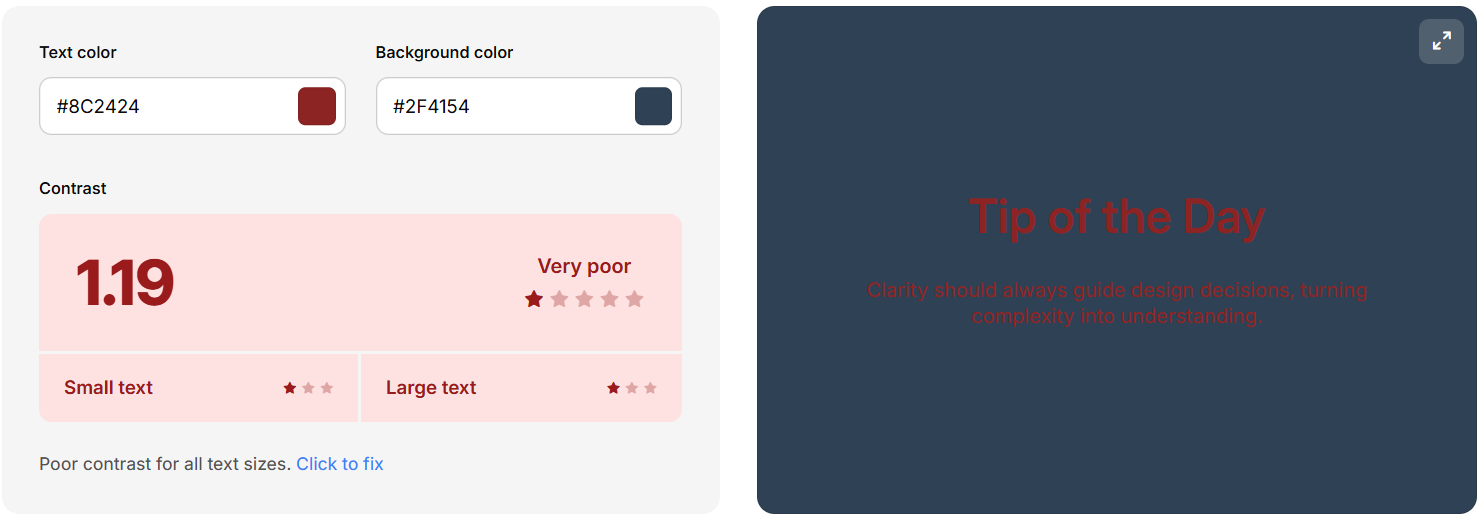
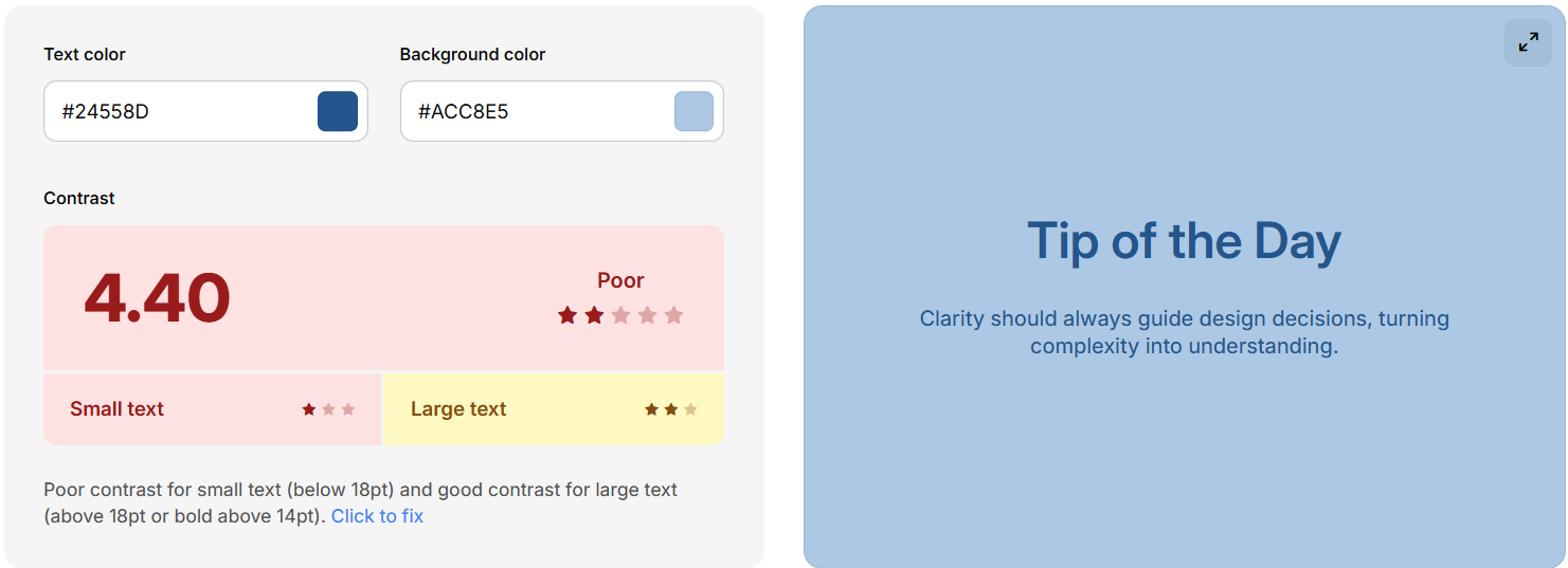
Examples
poor rating and hard to read
poor rating but readable
strong contrast, but hard to look at for some

Helpful links: Coolors contrast checker, Coolors Palettes
Make paragraphs & limit the space! Don't seperate every two sentences, but make a break. Open things up if the topic changes. Try to write easy-to diguest sentences without sounding too cryptic, especially on pages meant to be informative.
- avoid big textwalls, make breaks
- don't go full width, esp. bad on large deskops
- make content easy to understand
Avoid overstyling text, site might become unwatchable due to how confusing it is with downsides such as visual overflow, bloat and focus issues.
- only color actual highlights to stand out
- minimize font use, use readable fonts
- use i, u, s and b within reason
Images
Graphics are my favorite element on websites, but they can be used in good and in bad ways. Common issues are inconsistency, file and display size as well as lack of theme.
- make consistent graphic style (on same page at least)
- check size & overlapping on zoom/in/out
- use small and/or compressed graphics loading in. kbs, not mbs
- galleries need small thumbnail versions, not the HD file. Link those.
- use lazyloading down the page, priotise visible graphics on load
GIF overuse is very common in creative spaces and something I won't be jumping onto. I don't really have personal rules for myself. I don't care about using them. I'd rather have a nice illustration to make work stand out instead of a wall of blinkies and personality GIFs and whatnot. Not more than one or two on a page, if anything. I'm here for content & my personal projects. GIFs annoy and steal attention. Imagine books had them, haha
Welcome to my enter screen
No need for empty landingpages, but informative ones. A screen that stats enter is not inviting, but boring.
- let your actual homepage be the landingpage
- use enter screens if really necessary, to warn or inform
- If a specific graphic is your enter, mention or make it obvious where to click
Content holders & Boxes
I have a love hate relationship with boxed content. Can be good, can be ugly. Depends on the website structure.
- opaque background image, use solid boxes. Works nicer than text background color
- no or gentle box shadow
- border radius sharp or slighly rounded. bubble-style within reason
Padding
Padding is the space around inside elements. While there are uses for zero padding, its usually required for structuring a good site. Elements need space around them to breath.
Info: margin is used outside an element, while padding is for inside (distance to border)
No Padding
Philo
Lorem ipsum dolor sit amet, consectetur adipiscing elit, sed do eiusmod tempor incididunt ut labore et dolore magna aliqua. Ut enim ad minim veniam, quis nostrud exercitation ullamco laboris nisi ut aliquip ex ea commodo consequat.
Padding
Philo
Lorem ipsum dolor sit amet, consectetur adipiscing elit, sed do eiusmod tempor incididunt ut labore et dolore magna aliqua. Ut enim ad minim veniam, quis nostrud exercitation ullamco laboris nisi ut aliquip ex ea commodo consequat.
[TBA]