Drawing Like Others..
This entry is about an artwork, or well artworks (I did drew them all on the same canvas) I finished on the 28th of april! I wanted to try and draw in the artstyle of other media! This type of challenge can be done using popular brands, or art styles of other artists or your friends. Personally I found picking popular franchises the most interesting, as it features a lot of different styles, techniques and detail levels. From toony to anime and 3D.
The character I choose for this is of course my character Lui. (surprisinggggg).
I picked the styles I wanted to try myself, there is no rule or template. Well, templates do exist but I myself simply grabbed a grid and googled all sorts of things I found either cool or challenging. Not all the styles I drew here are my cup of tea, but this is a style challenge and I of course wanted the challenge. Which includes things I typically don't do. That's the fun after all.
Here is the final grid with every drawing finished! My style, Disney, Animal Crossing (new horizons), Super Mario, Simpsons, Pokemon, Fairly Oddparents, Adventure Time and Kim Possible!
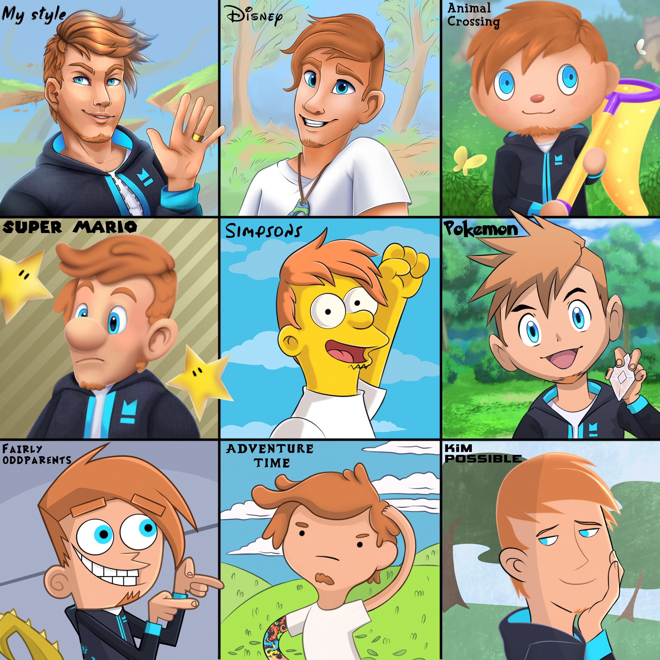
I did also save a few progress shots of it. It's always interesting to look back at unfinished stages.


In Detail
I also wanted to break down why I picked what I picked! There is some reasoning behind some! As well as talking about the style themselves and pointing out some details.
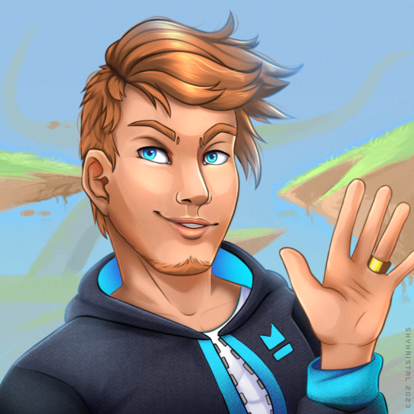
My Style
My artstyle. Self explanatory. Altrough, I tend to experiment here and there with how I draw sometimes. This is what and how I like to draw mainly. Full render, semi realistic with detail. Mostly lineless background that shows a place or scene. In this piece specifically I drew the flying islands in my character world. They're always fun to draw and fit into everything.
Disney
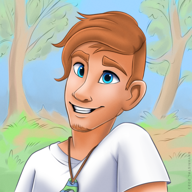
Disney is one of these styles I always loved, but isn't a style I ever wanted to use as *mine*. It's a charming, dynamic style which shows a lot of emotion and kindness. But at the same time is quite generic. A lot of things look similar and give off a similar feel. I notice this whenever I see disney's art, 3D animations or other people who are copying this type of style. Very lovely, but not fitting for every situation and vibe. I especially like this style for kind and friendly artworks with a lot of warmth in them. Which is also why I gave Lui this kind of emotion here. I also love Disneys soft stading, which is mainly used in covers of the old 2D animated films! I ended up using this shading technique here, instead of keeping things flatcolor, or 3D animation based.
Animal Crossing New Horizons
Aww yes. Animal Crossing. One of the games I grew up with. Wild world used to be the first animal crossing game I touched. Wonderful times........ until 10 year old me got the idea to get an action replay and destroyed the entire game with it. Rest in piece ACWW.
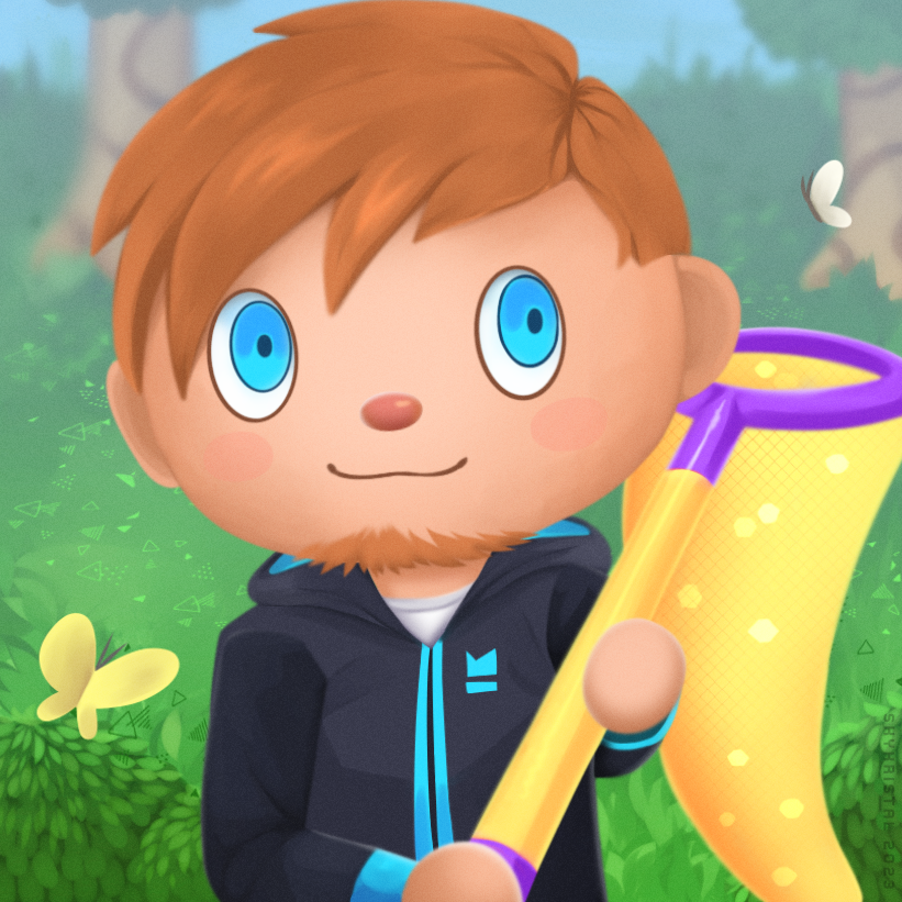
O-Oh right we are still in the drawing challenge blog post. hah. right. So- Out of all the animal crossing games, I picked New horizons for this. But why? Simple. This style is my favorite. When I saw the first screenshots of the game back then I was very happy about the more realistic body types in comparion to the older titles. It's nothing that ever bothered me, I only knew it like that. But as soon as new horizons came out, I noticed how squished the no-neck-villager always looked.
You might have noticed that it was a normal net in the progress shots. I gave him a golden tool later on, because it's cooler. I myself own golden tools (...from specific places) and felt like it would be more fitting to give him the fancy golden one. It's a shame they break in game in the newest game :/
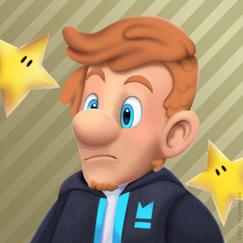
Super Mario
AAAAAAA yees! One of my favs. Not my favorite outcome actually, but the style itself is very fun to me. Super mario is actually the origin of my ocs. (my world was a very cringy thing at first.. puh, glad I never drew or wrote stuff until 2019 xD) Seeing Lui in this style is very accurate and very inaccurate at the same time. You know, I draw all my OCs in my personal style, but the character's porportions themselves actually look kinda like this piece here. But I never sticked to that, because it looks... absolutely terrible and not very hot lmfao. But, well, here we have it. Super mario Lui.
I really like Nintendo's silly style with it's roundness x)
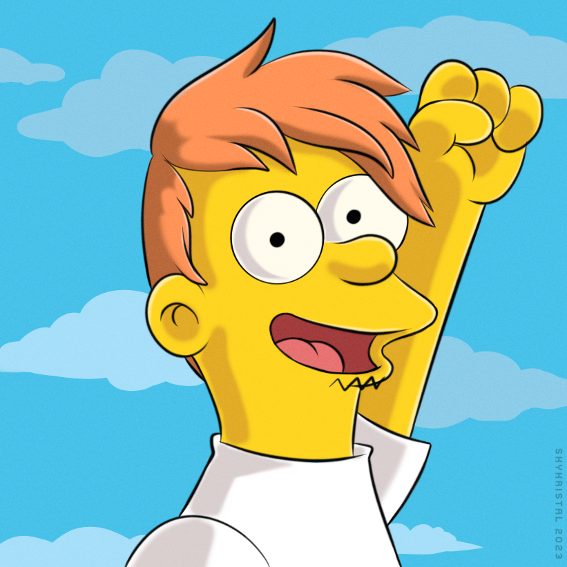
Simpsons
The Simpsons is a series I actually never wachted myself, unless a TV was running at a friend's house. I watched one or two episodes with them because of it. But I don't know aynthing about it and I'm not into it. The reason why I picked the simpsons is because of the silly funny artstyle. I was thinking "hm how would Lui look as one of these yellow guys". That is really all lol. I like how it came out though! He looks funny, but maybe a bit young.
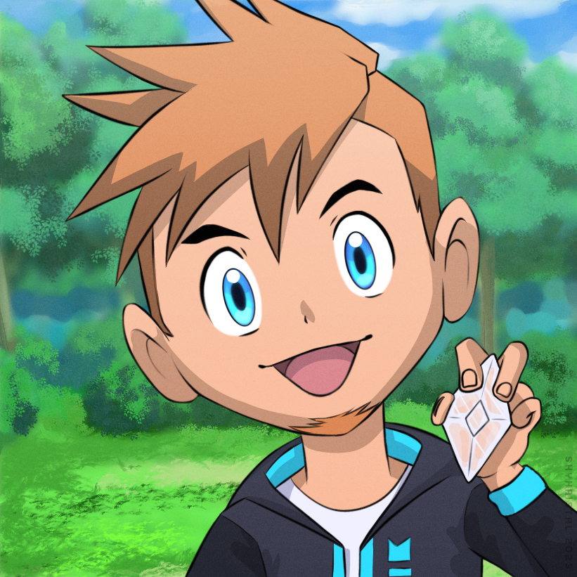
Pokemon
Pokemon is a very similar case to the simpsons. Never watched the series, never bought a game. It wasn't something I grew up with. But out of all the anime stuff out there, Pokemon was the thing I was most familiar with and wanted to try for that reason. This is the newer style. Much older pictures of the series look different but I wanted to go for this more modern style as I like it a bit more. Turned out cute. I like the more detailed eyes in this new style. The spikey hair was also fun to do.
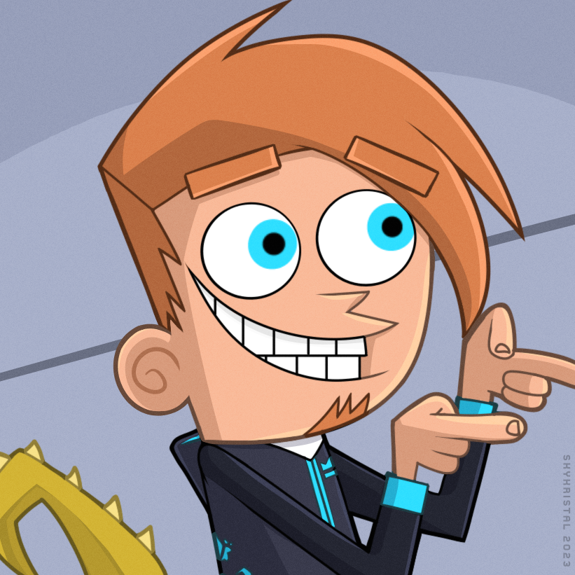
Fairly Oddparents
The fairly oddparents is a series from my childhood. I watched it a lot as a kid. But I always disliked the artstyle a lot for some reason. It might be the broken hands, spikes and the overall weird proportions. However this series actually influenced some aspects of my character world as well. Primarily the character sizes and hight differences. It was definetely some inspo. I like how Lui turned out. I was struggeling with this one quite a bit at first but it tunred out better than I thought it would.
I also gave him a golden dragon tail here x)
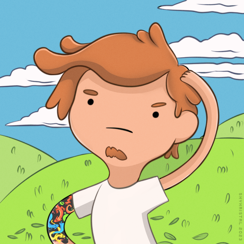
Adventure Time
Just a fun, more simple art style I wanted to try out. I never watched adventure time. It's also not really a series that was there in germany to begin with. I grew up with different shows and as I got older I never watched cartoons in general. Just stumbled across this again while searching for styles bascially.
Because of the long funky arms, I thought it would be a great opportunity to draw his dragon marking.
Kim Possible
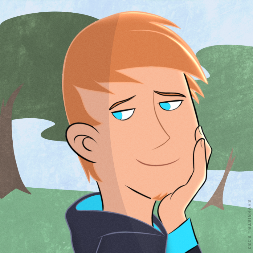
And lastly, Kim Possible! Now the intro song is bounching around in my head again. Oh no. I watched this series a lot back then! One of my favorites. So I of course wanted to try & copy the way the characters look there. Wasn't all too easy, unlike most others in this post. I was a little undecided about the shading. But I think it turned out alright. Mainly used Ron for reference, which I think is noticeable. But he was also quite fitting for Lui's look.
I might do this challenge again with even more! Maybe next time, I will use other artsts styles or perhaps draw my character as different pokemons, animal crossing villagers. etc. Ideas are endless.
Overall this challange was A LOT OF FUN! You can also find out how bad your good you are at drawing what you typically don't do. Or how easy or hard it is to draw more simple or complex. To me, this challenge was much much easier than I thought it would be. It was more of a little fun game rather than struggeling and trying to get the styles right. The struggle was there for a few details but the fun was bigger.